X Redesign
A self-directed redesign of X focused on navigation, feed hierarchy, account switching, accessibility, and feature discovery.
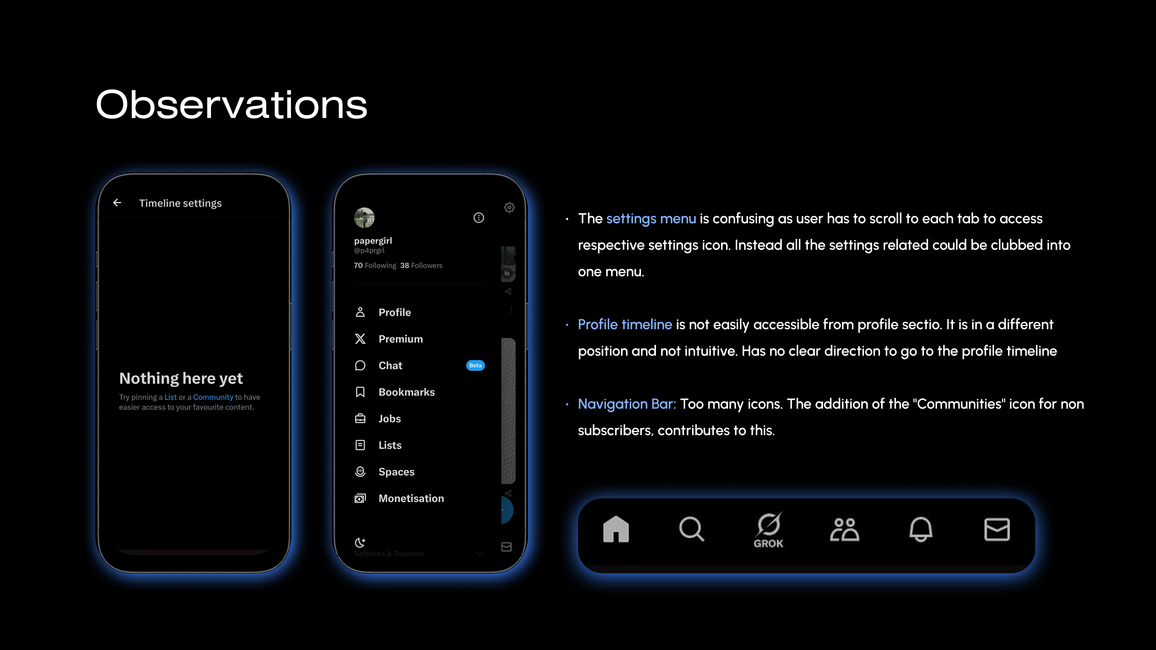
The audit surfaced too many competing controls, unclear navigation patterns, and content that was harder to prioritise than it needed to be.
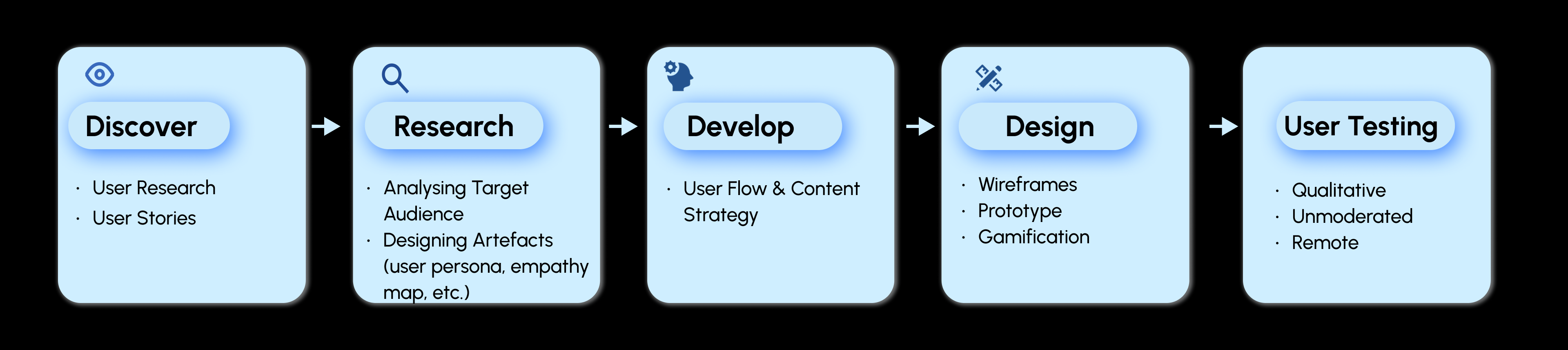
I used heuristic evaluation and user research to decide what to simplify, move, or add before redesigning the key screens.
Heuristic evaluation
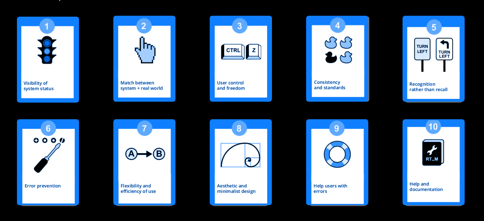
1I reviewed the current experience against Nielsen's heuristics, then carried only the findings that led to an actual design decision into the redesign.
| Heuristic | Issues | Recommendations | Priority |
|---|---|---|---|
| Visibility of system status | Vague error messages and unclear feedback when posts stop loading, rate limits are reached, or an account is restricted. | Provide clear feedback about what happened and what the user can do next. | High |
| Match between system and the real world | The feed can surface “For you” content before posts from people the user follows. | Prioritize “follower first” posts over trending ones. | High |
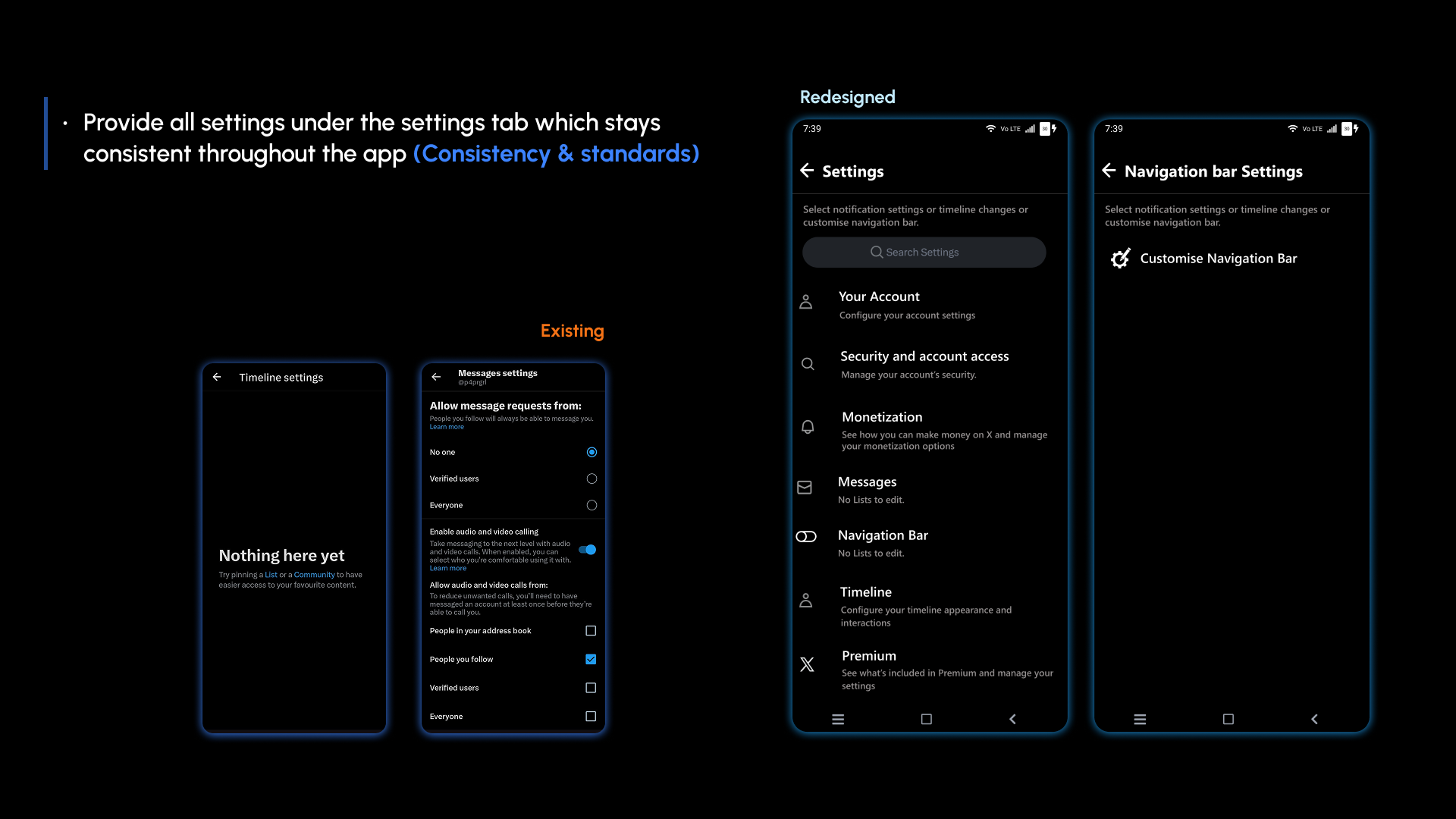
| Consistency & standards | The “more options” pattern is inconsistent, and settings are spread across the experience. | Make the menu consistent and keep settings together under Settings. | High |
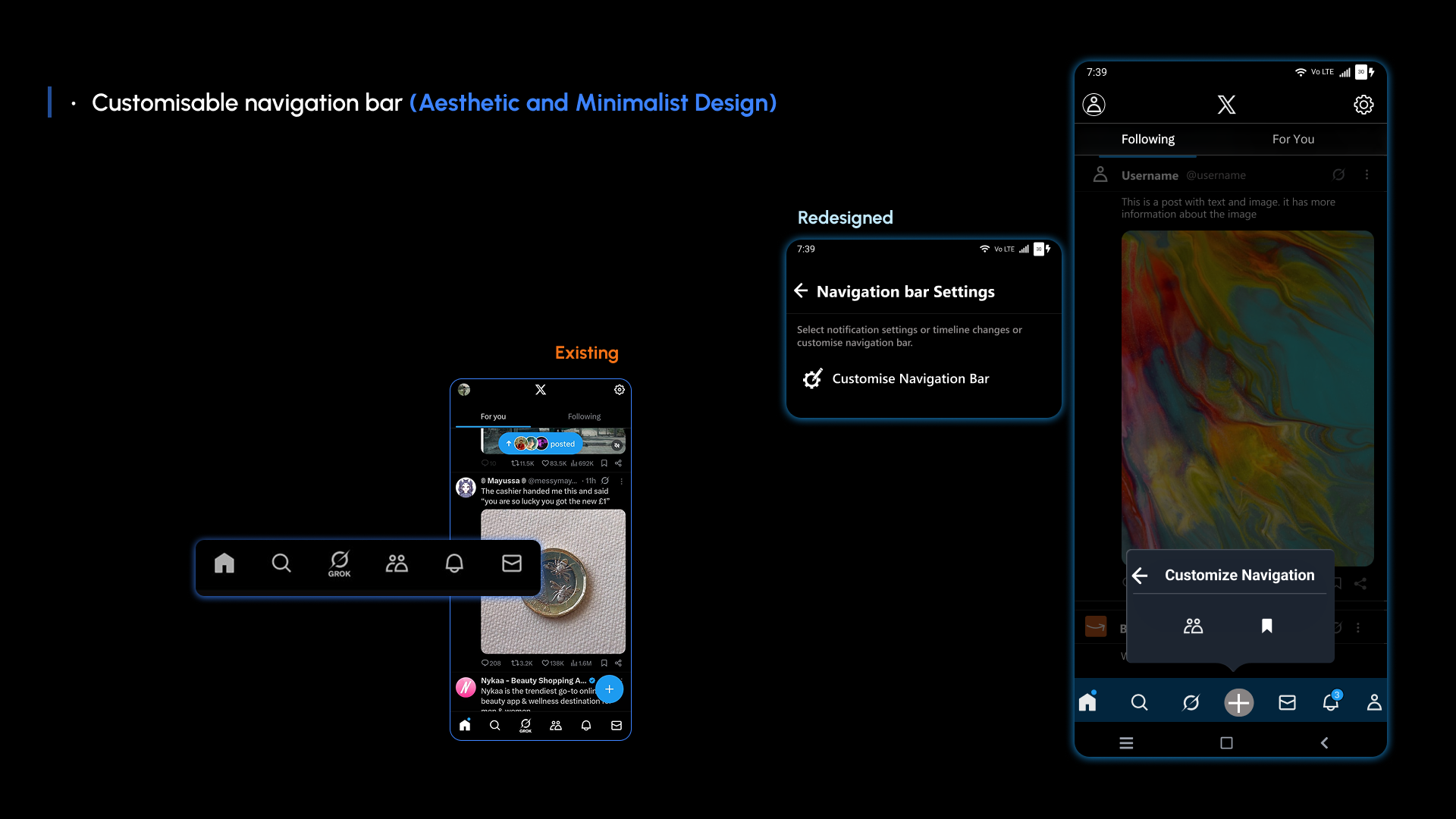
| Recognition rather than recall | Profile Timeline is not part of the main navigation even though it is a familiar destination. | Add Profile Timeline to navigation where users can identify it quickly. | High |
| Flexibility & efficiency of use | Creating or switching accounts takes unnecessary steps. | Let “Create new account” be accessed from both side navigation and the profile timeline. | Medium |
| Error prevention | The interface does not always prevent confusing or avoidable actions. | Use clearer restrictions and confirmation states before actions that can disrupt the experience. | Medium |
| Aesthetic & minimalist design | Too many icons compete with the content, while profile hierarchy is weak. | Reduce competing controls and make the profile name more prominent than the username and time. | Medium |
| Help & documentation | Help / Support is not clearly identified as an action. | Use an icon to identify Help / Support and keep it visible with the other options. | Medium |
Research
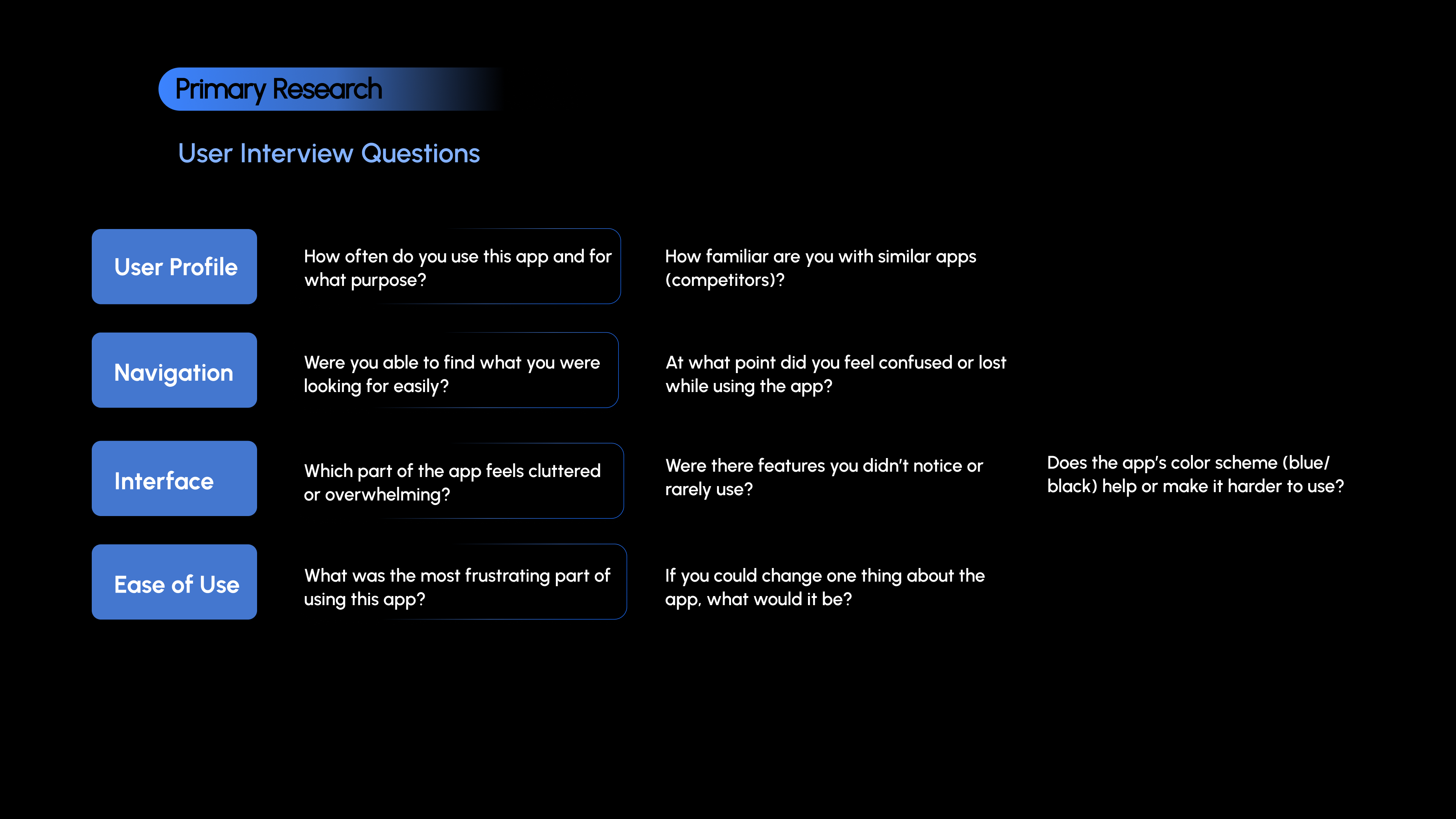
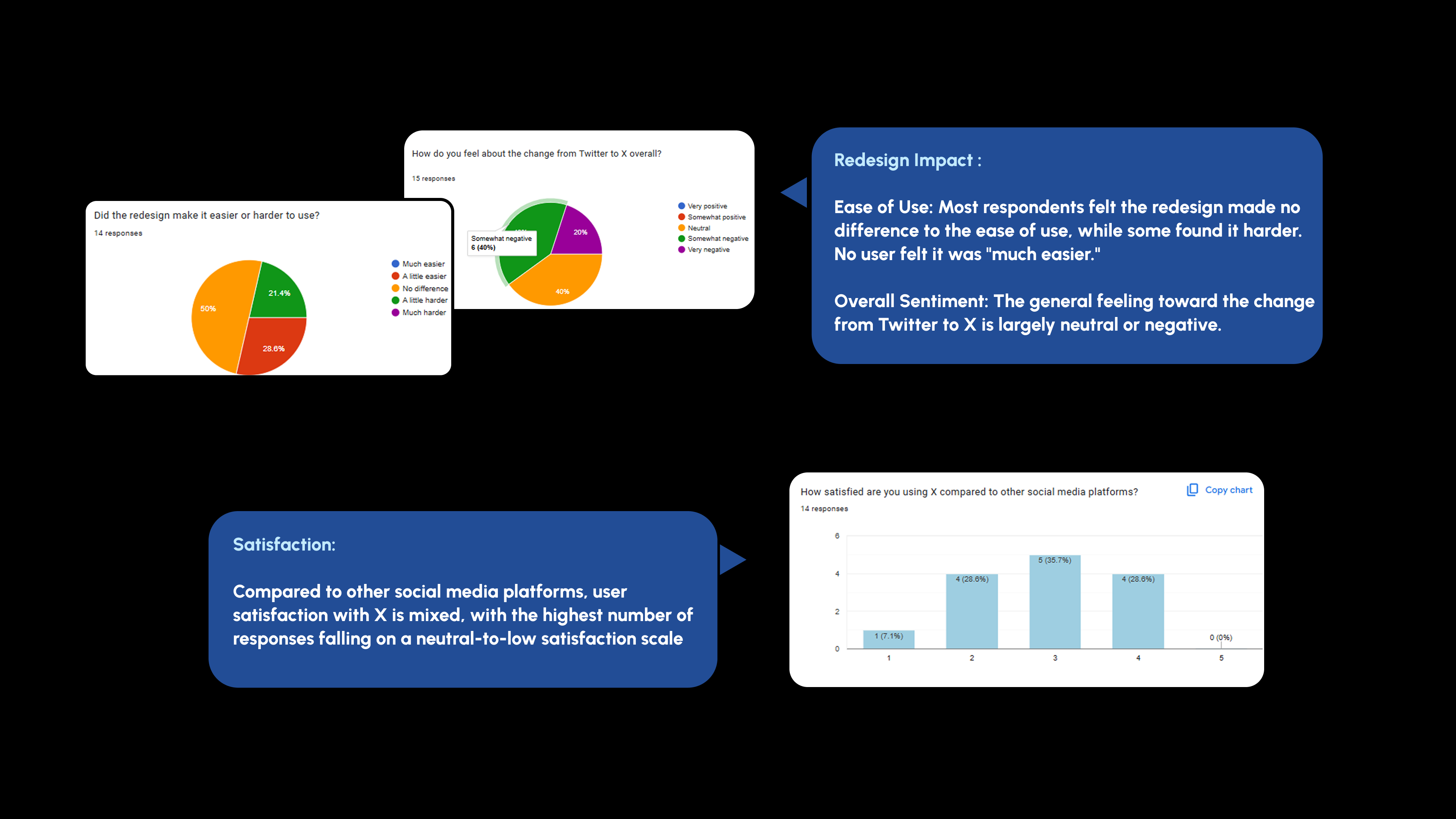
2The primary research was used to check whether the problems from the heuristic review matched how people actually used X.
Users
3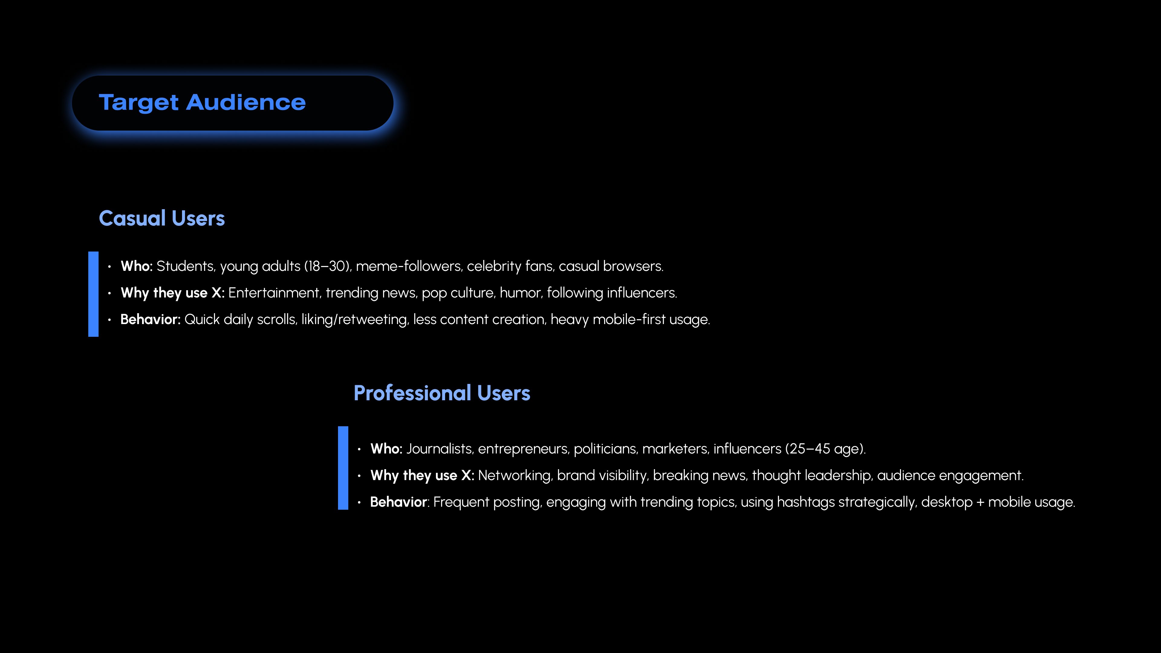
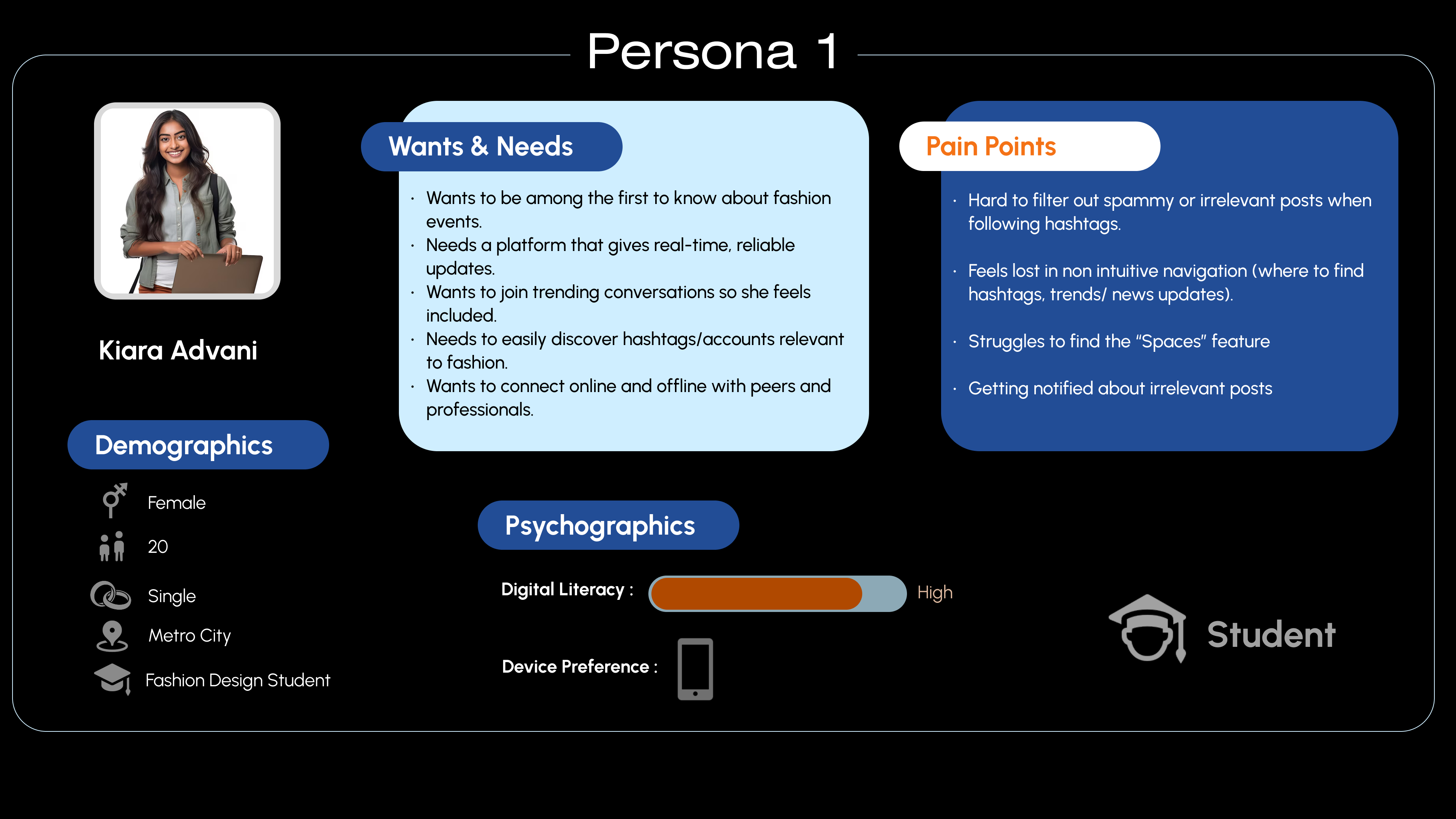
Personas
—
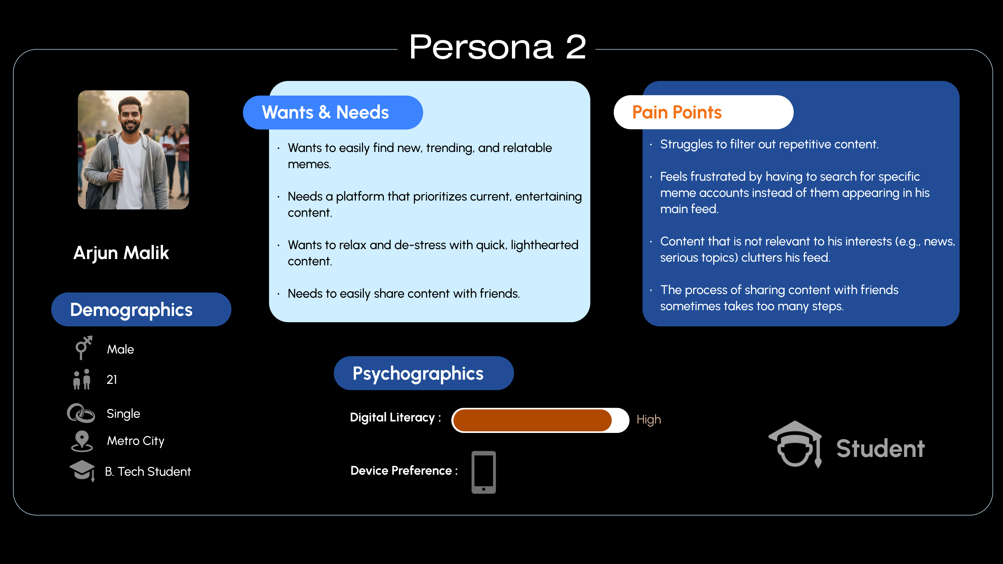
Context
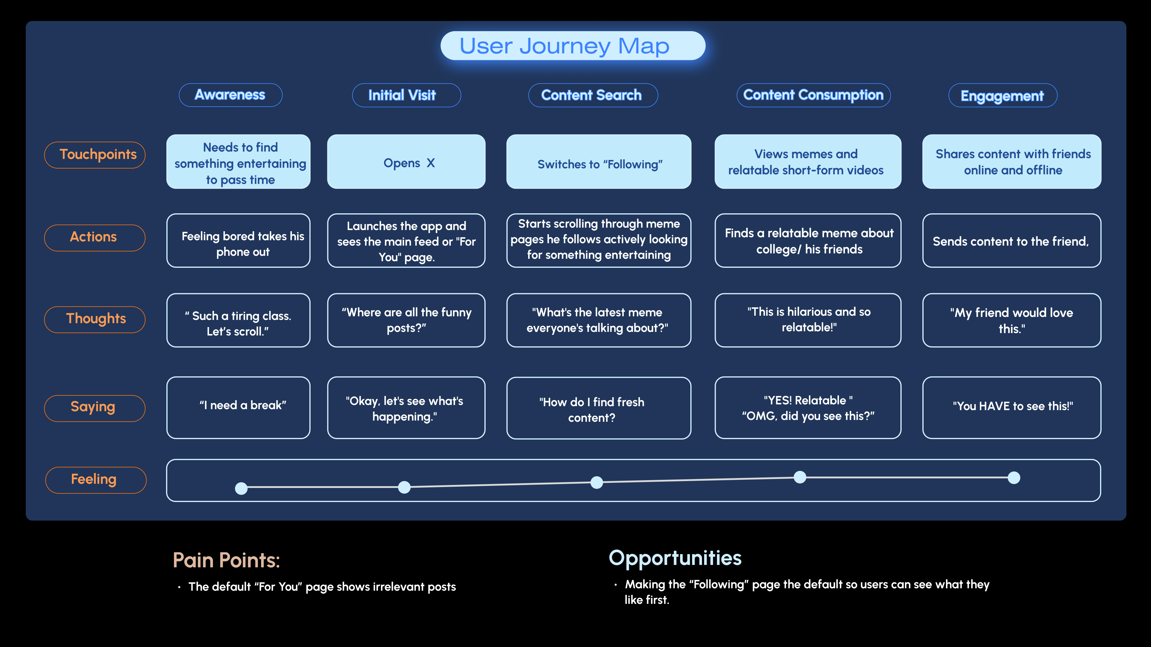
—Needs something entertaining to pass time.
Opens X → finds fresh content → engages with something relatable → shares it.
User journey
—
Wireframes
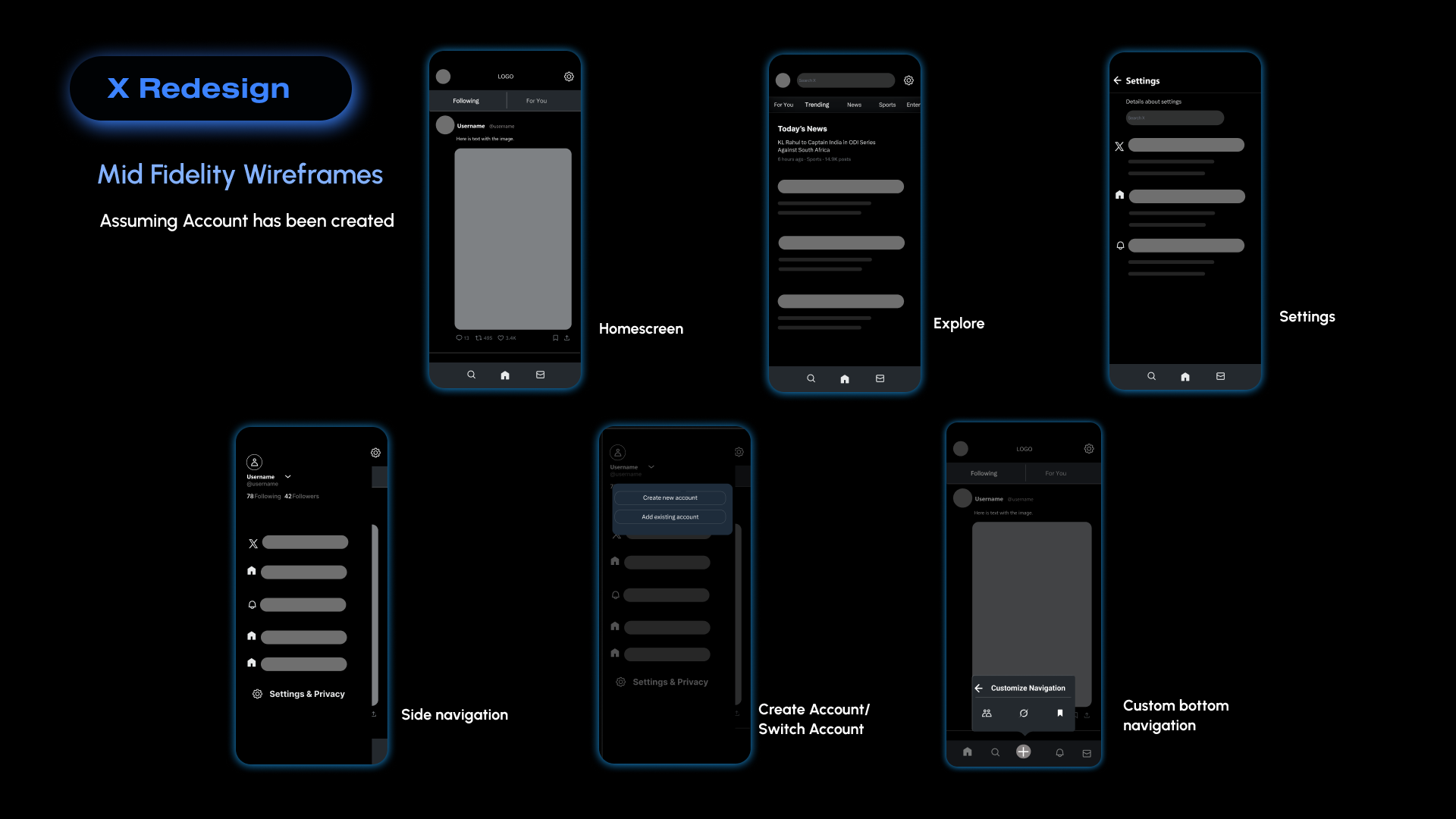
4The first pass focused on navigation, account switching and the main screen structure before the final UI.
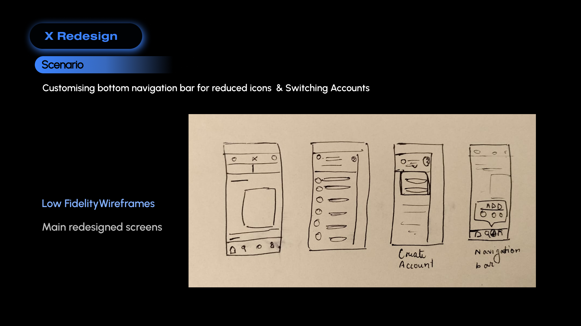
Design changes
5The changes below follow directly from the heuristic evaluation and research.
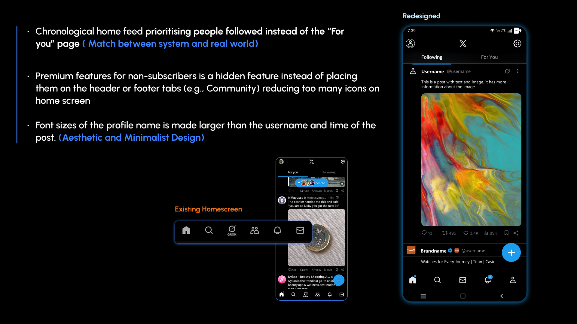
• Prioritize “follower first” posts over trending ones.
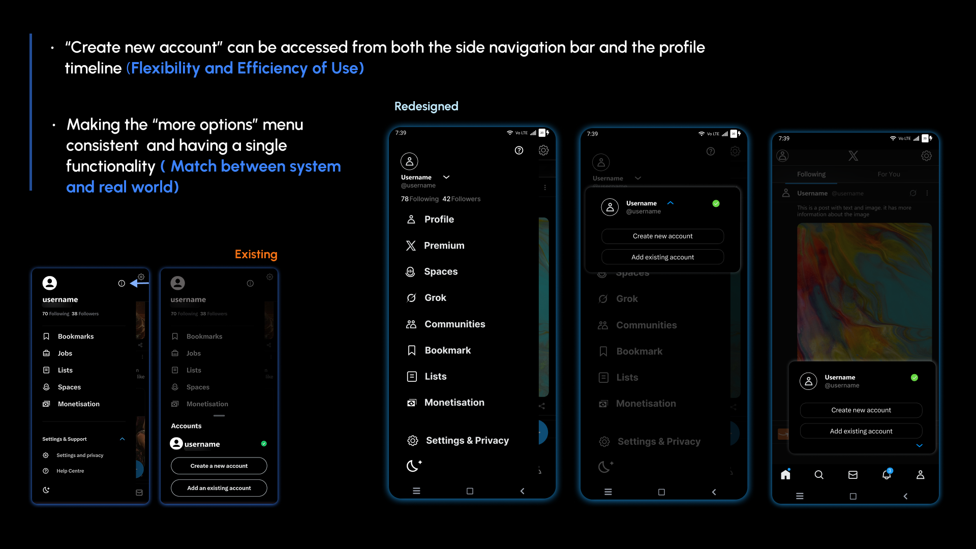
• Make the “more options” menu consistent, with a single functionality.
• Keep all settings under the Settings tab.
• Add Profile Timeline to the navigation bar.
• Let “Create new account” be accessed from side navigation and the profile timeline.
• Move premium features for non-subscribers out of the main navigation to reduce icon clutter.
• Make the profile name larger than the username and time of the post.
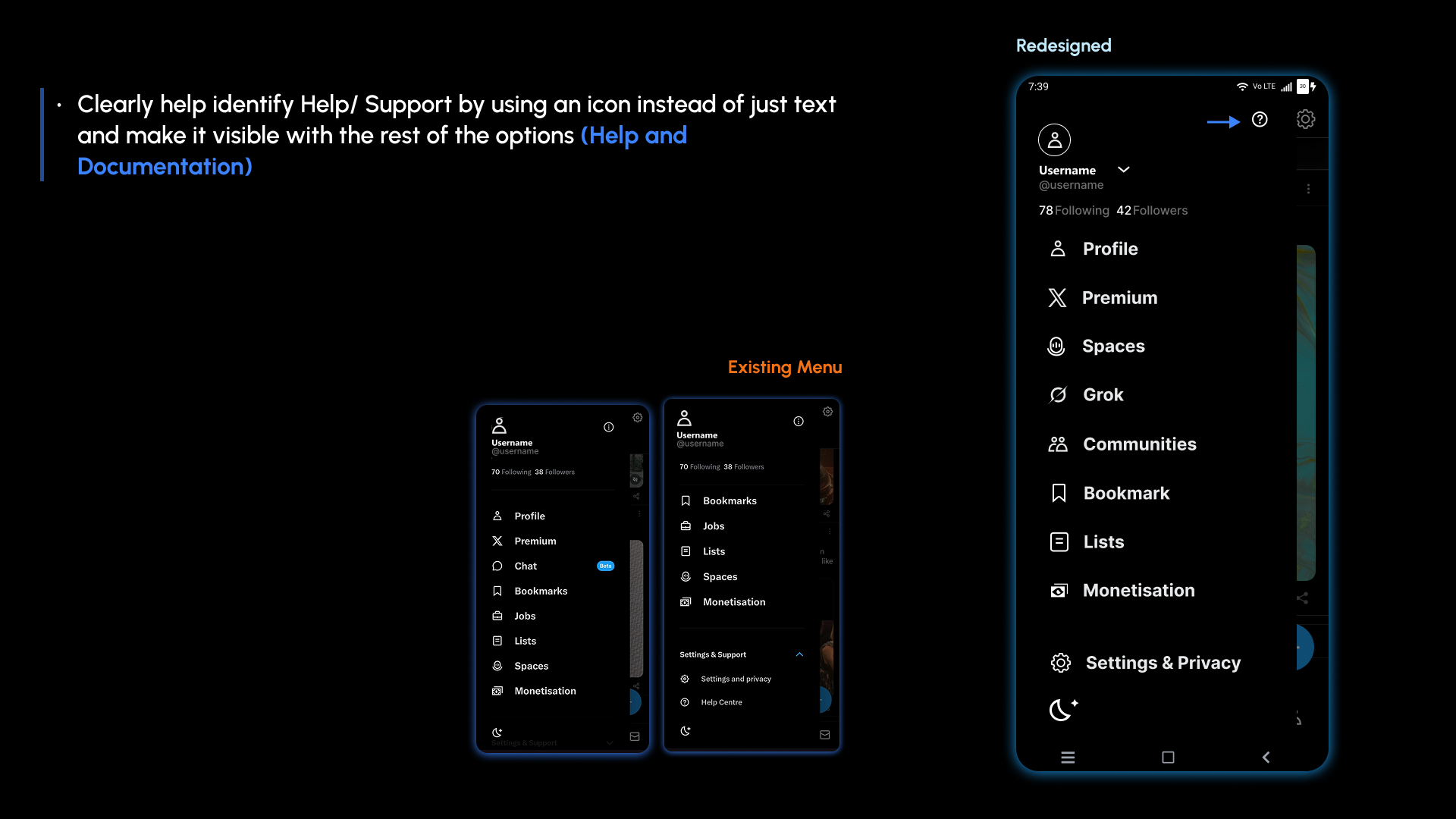
• Identify Help / Support with an icon and keep it visible with the other options.
Prototype
—Usability testing
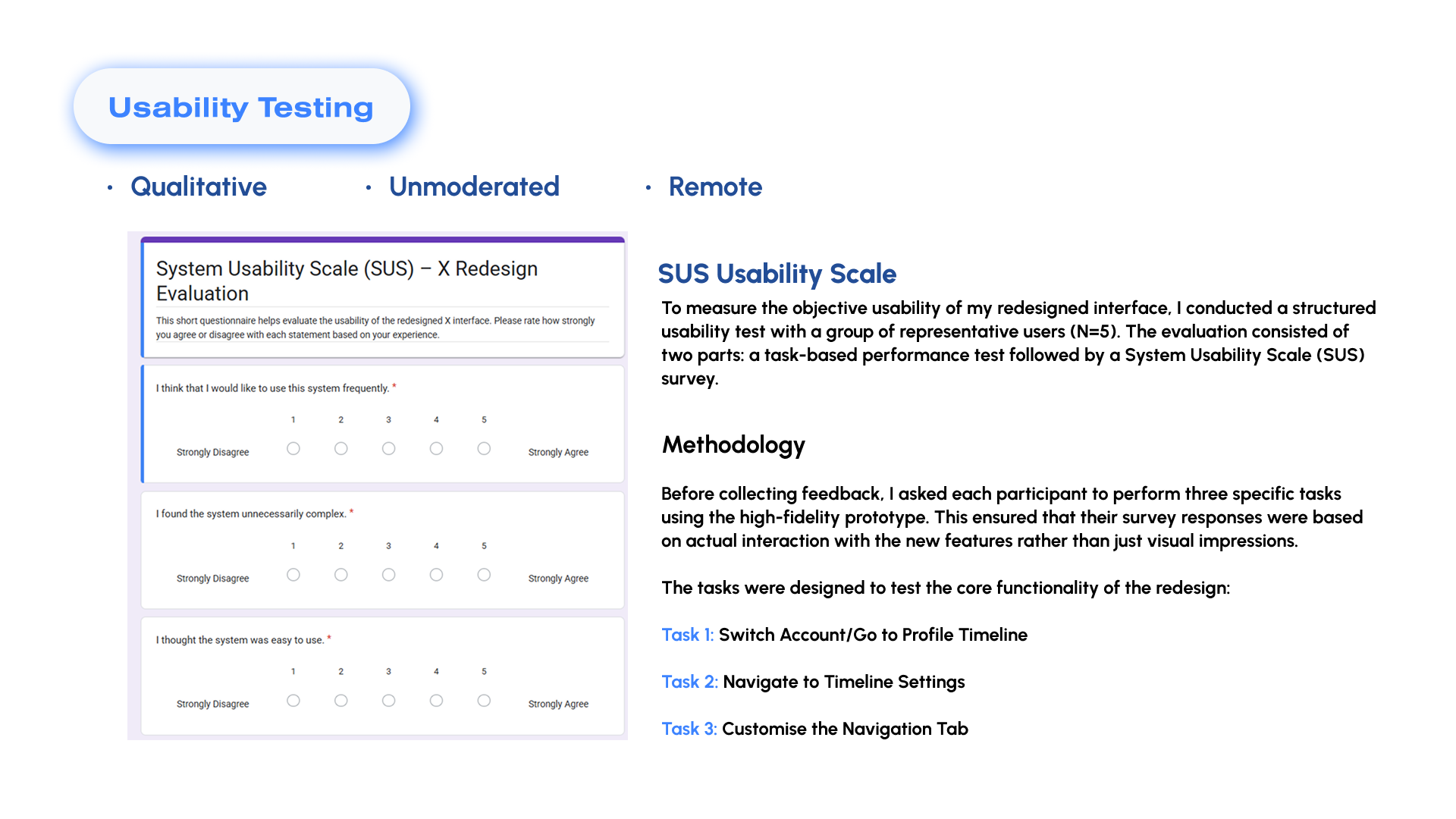
07I tested the redesigned flows with five representative users using three tasks, followed by a System Usability Scale (SUS) survey.
Switch Account/Go to Profile Timeline · Navigate to Timeline Settings · Customise the Navigation Tab.
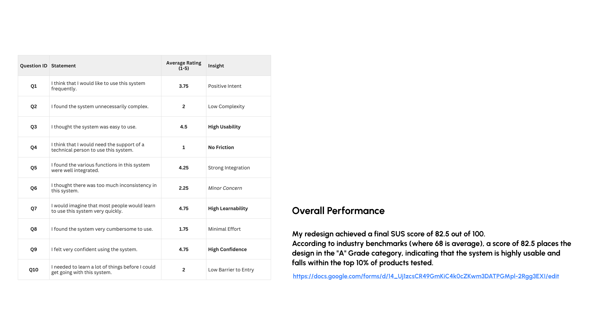
The redesign achieved a final SUS score of 82.5 out of 100, above the stated industry benchmark of 68.
Gamification
7After addressing the core usability issues, I explored gamification as a way to increase engagement without adding more noise.
Why gamification
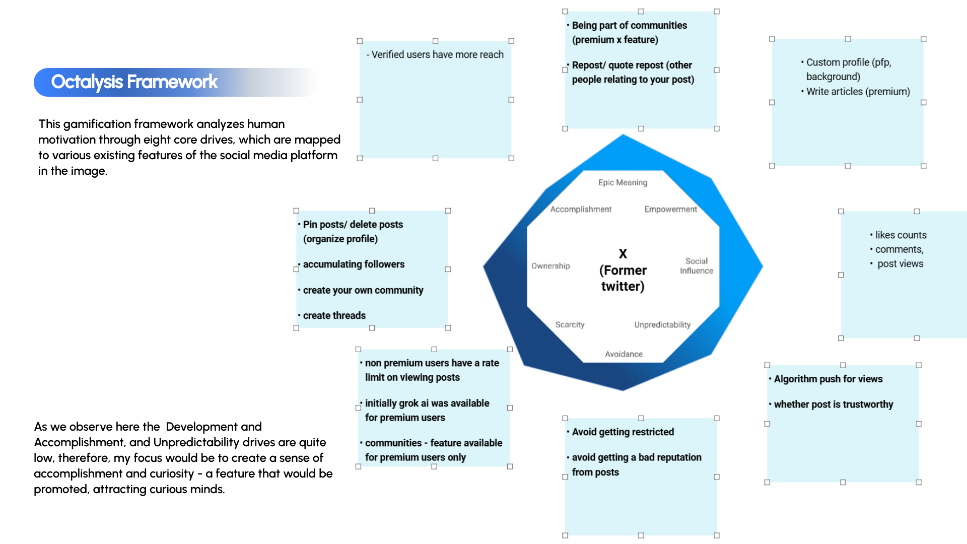
Gamification is design that places the most emphasis on human motivation in the process. In essence, it is Human-Focused Design, as opposed to “function-focused design”.
Gamification is the craft of deriving the fun and engaging elements found in games and applying them to real-world or productive activities.
Octalysis framework
—
UI design
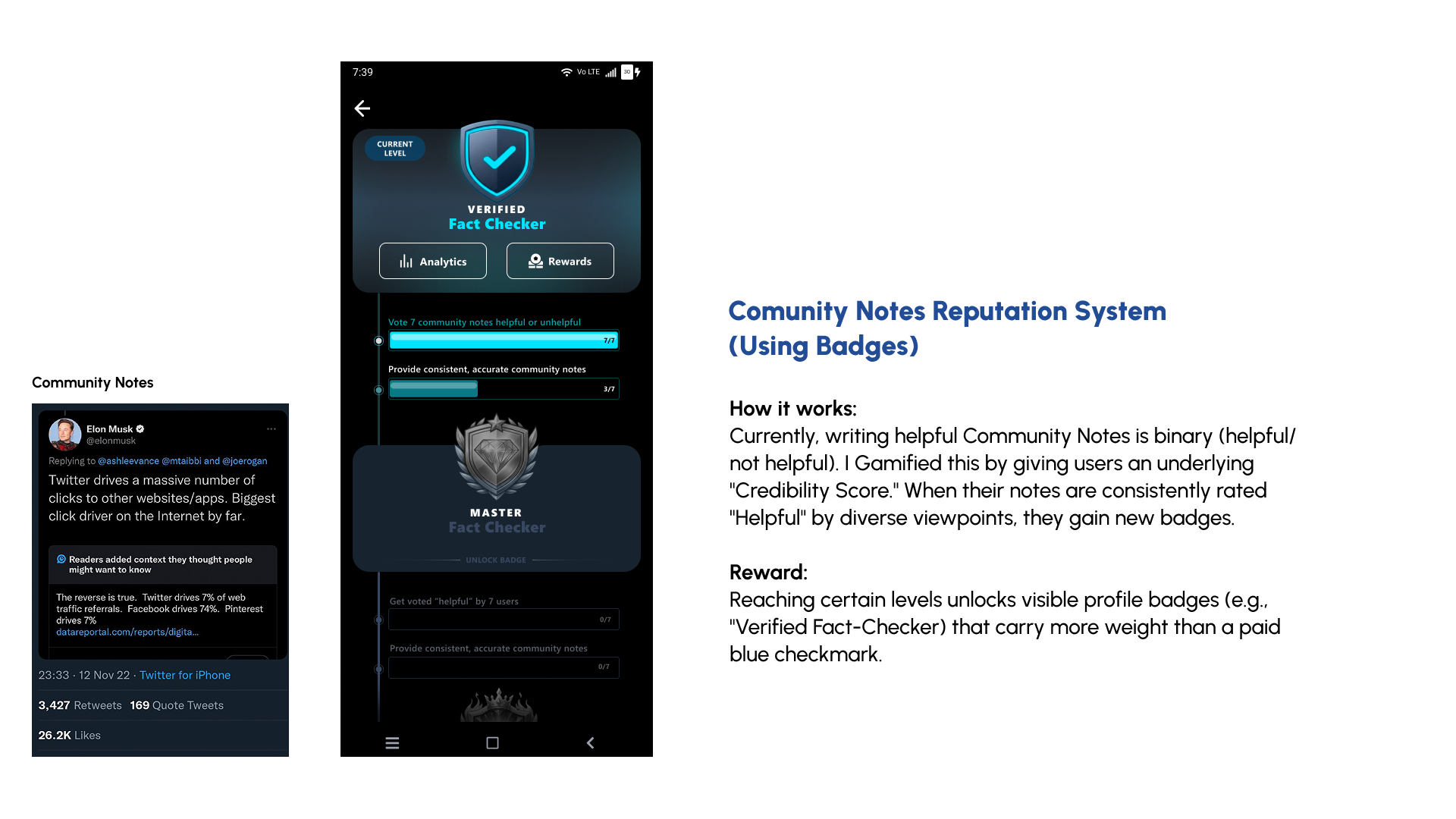
—
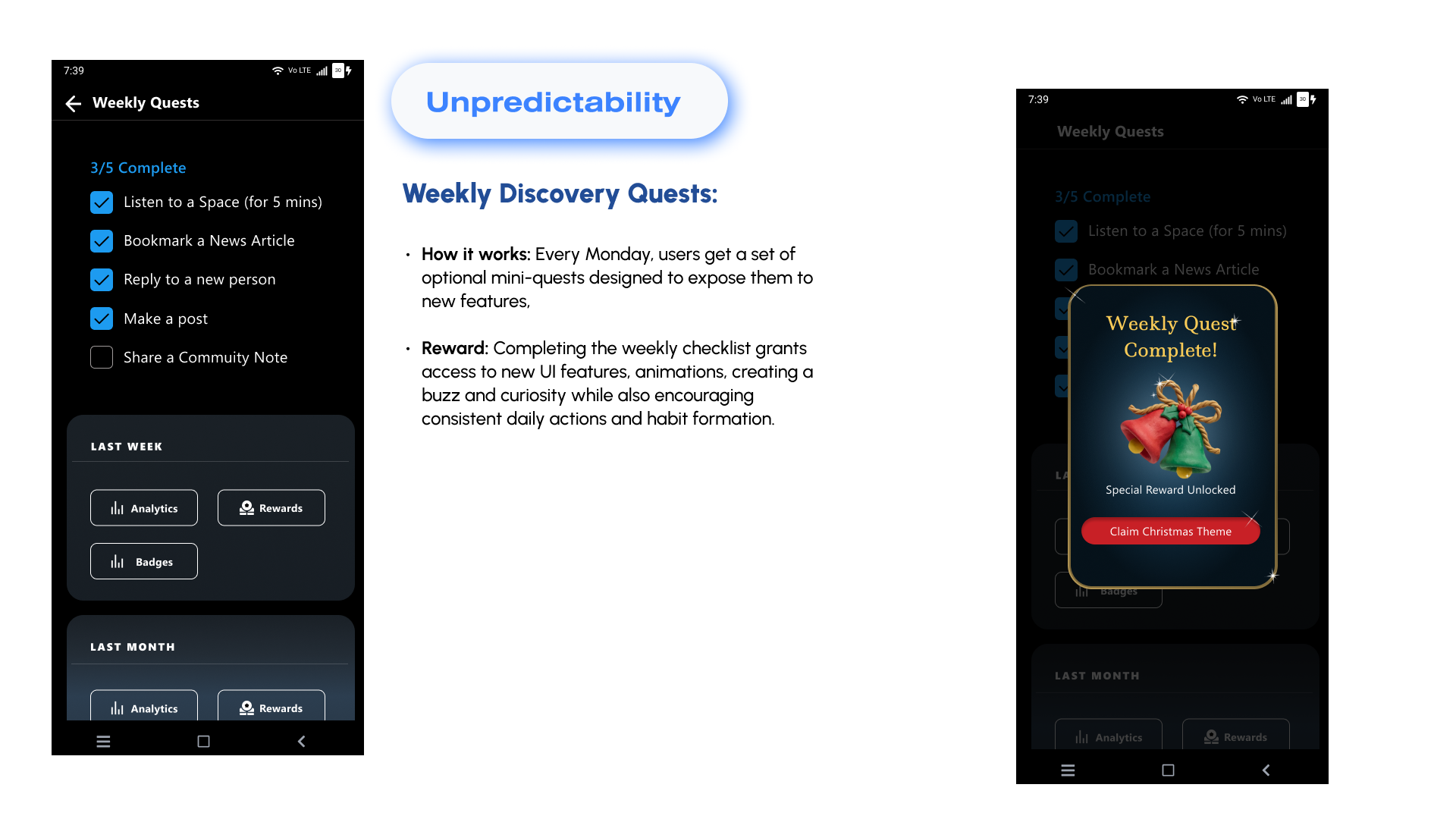
Prototype
—Validation
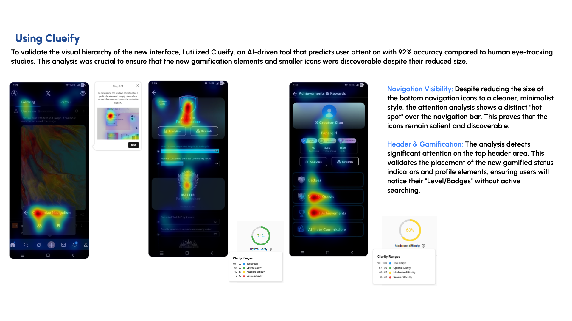
—I used Clueify to check whether the reduced navigation and new gamified status elements remained visually discoverable.
Accessibility
08I checked the redesigned interface against WCAG considerations around contrast, type size, interaction flexibility and content accessibility.
WCAG audit
—Technically, yes. The buttons, menus and navigation structure generally meet basic accessibility standards for screen readers, keyboards and visual adjustments.
Contrast: Primary text on black appears well above 4.5:1 (Level AA) and likely around 7:1 (Level AAA).
Font size: Main text is 16–18px and legible; helper text is borderline.
Functionally, no. X relies heavily on user-generated content, and much of that content is missing alt text, creating barriers on the main timeline.
UI design
—The accessibility edits carried into the UI through clearer account controls, settings, help placement and a customisable navigation bar.
Outcome
9The redesign connects heuristic findings, primary research and usability validation to a more focused X experience, with clearer navigation, feed priorities, account controls, feature discovery and accessibility.