Problem 01
Complexity makes investing harder to understand.
74% of non-investor households are affected by complexity and lack of accessible information.
Your goals first. The paperwork later.

Investment onboarding often asks users for high-trust information before they understand the value they’re getting. GoReach reimagines the first five minutes by letting users start with their goals, get useful guidance, and access human support before verification.
I worked across research, flows, interaction design, and prototyping, from problem to final UI.
74% of non-investor households are affected by complexity and lack of accessible information.
73% are affected by risk and return concerns, while 51% are affected by trust and transparency issues.
I looked at how existing investment products build trust.
I then tested the experience with 3 users aged 25, 36 and 49.
The user tests surfaced similar concerns around clarity, transparency and confidence. Together, the secondary research and user testing reinforced the need to create value before asking for verification.
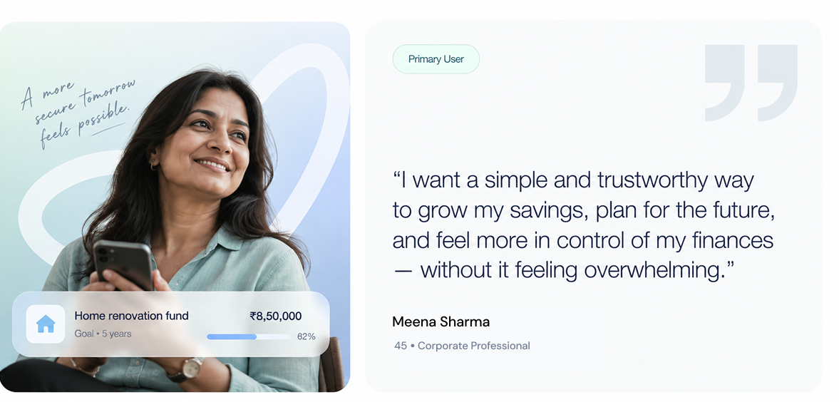
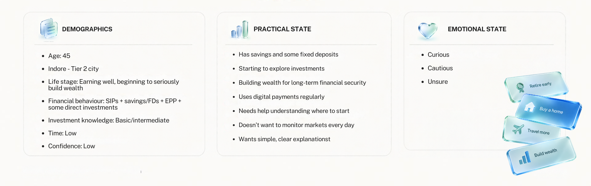
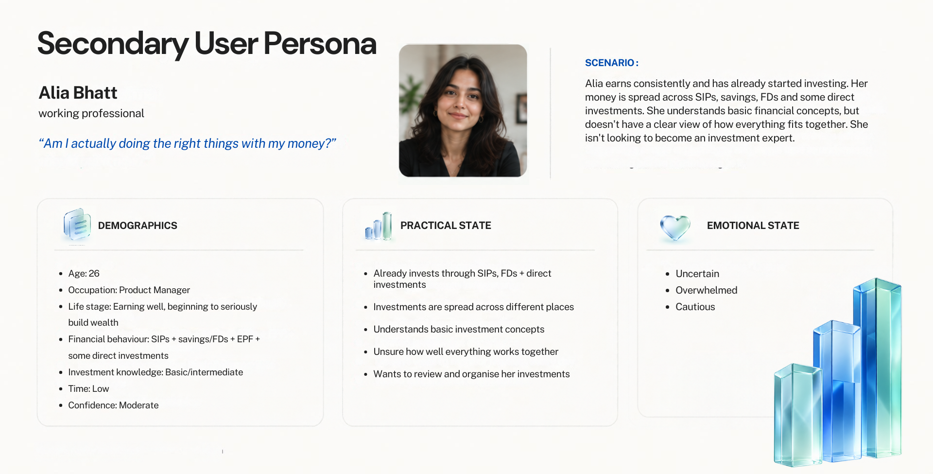
The onboarding moves from goals and guidance to trust, then asks for the information needed to personalise the experience.
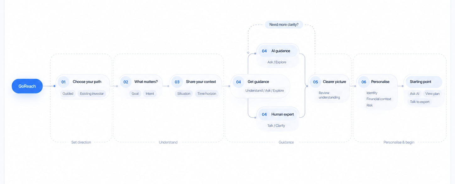
The research shaped four changes to the onboarding experience.
Start with what users want to achieve.
Give useful guidance before asking for verification.
Give users both immediate guidance and access to human expertise.
Explain why information is needed before asking for it.
I tested the new onboarding logic through early iterations before refining the final screens.
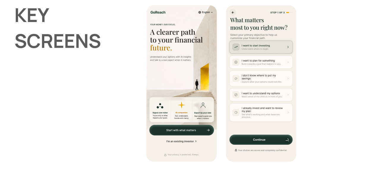
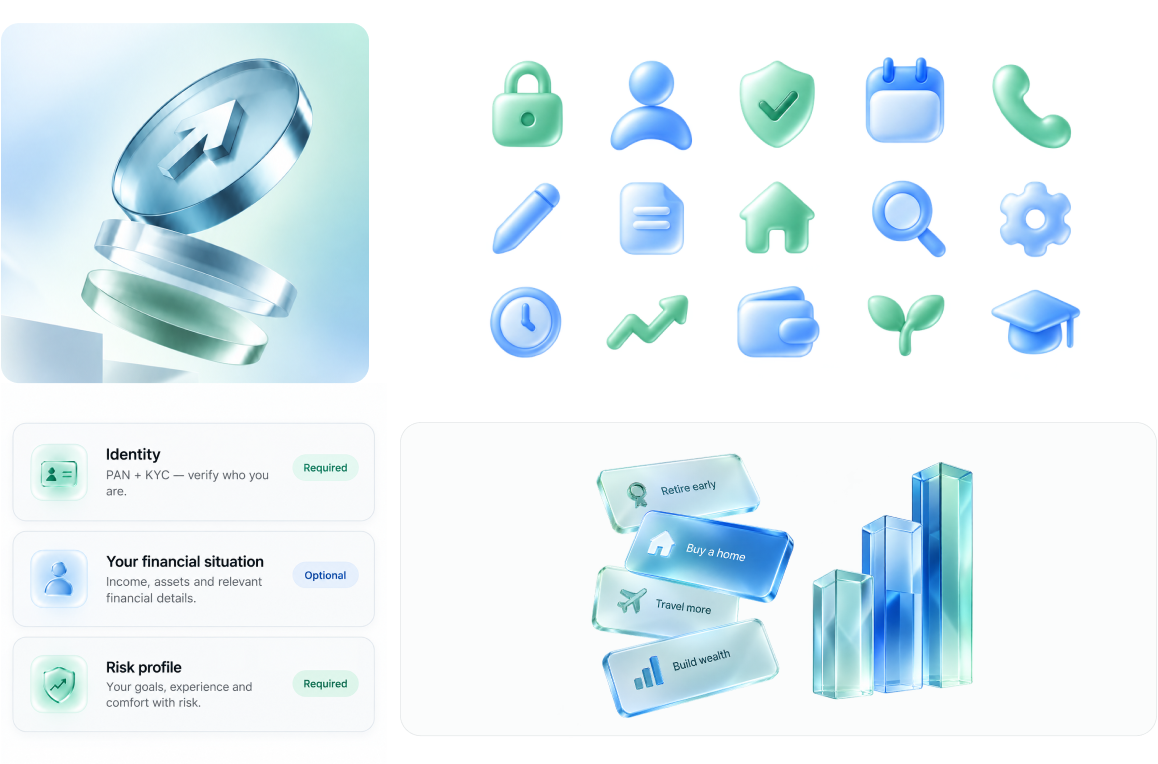
I created a consistent design system along with icon set for the onboarding experience and refined the visual language so the interface stayed clear and cohesive.

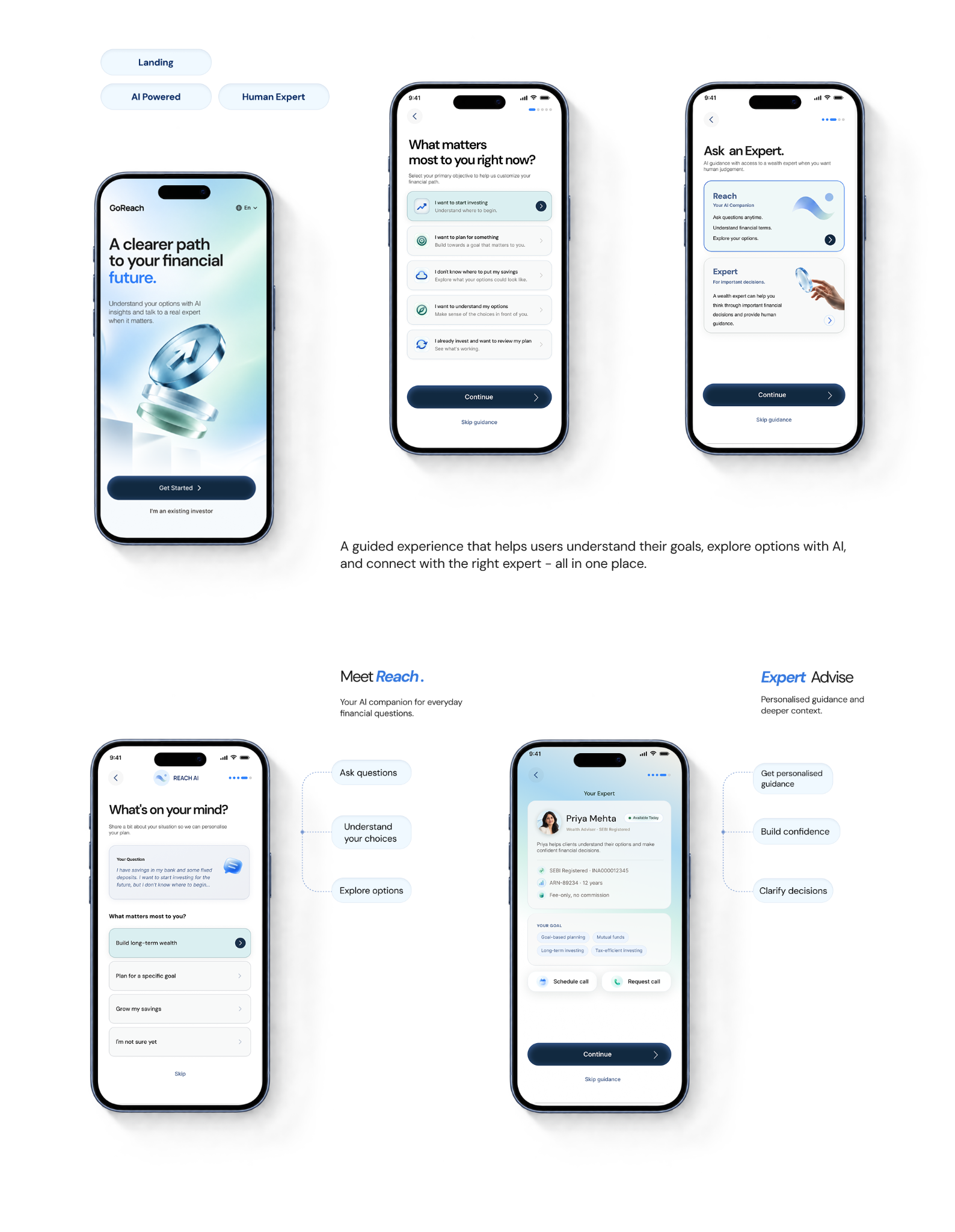
The final experience brings the guided onboarding, Reach AI and human expert support into one clear path before verification.
I tested the redesigned onboarding with the same 3 users. I looked for changes in clarity, confidence and trust.
The experience felt less intimidating around handling money.
Users understood what to do next with less decision fatigue.
Seeing a plan before verification reduced uncertainty, while human support added reassurance.
“I didn't feel scared about my money here.”